
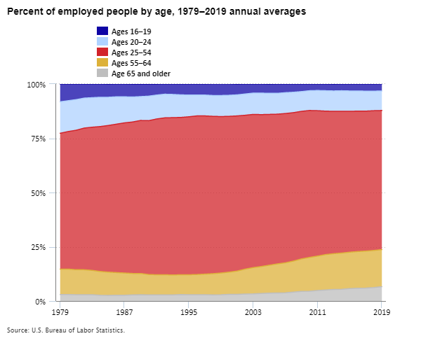
Forty years ago, teenagers ages 16 to 19 made up 8 percent of all U.S. workers. By 2019, that share fell to just 3 percent. With fewer teenagers working, the face of American labor looks much different today than it did when the Bee Gees ruled the American pop charts.
Happy Labor Day! The U.S. workforce has been changing over many generations. It’s been changing with respect to the work people do. For example, an increasing share of workers is engaged in service or technology work, while a decreasing share is engaged in factory or farm work. My focus today, however, is on the people who do the work.
Here at BLS, we spend a great deal of time and effort measuring and reporting on employment. How many jobs are there this month? What kind of jobs? But as Labor Day approaches, I’d like to shift the focus away from employment and jobs and toward labor itself. Who are the people holding down the jobs that we count? What is the face of American labor? And how has labor’s profile changed—and yes, it has changed—over a generation or more?
So today I’m not going to say much about what jobs workers hold or what their jobs pay. Instead, I’ll focus on more personal characteristics of the people who hold the jobs—characteristics that are not a function of workers’ jobs, but that are intrinsic to the workers themselves. Is America’s employed population getting older or younger? Are African Americans, Hispanics and Latinos, Asians, and other groups making up an increasing share of employment? And so forth. Call it the “composition” of America’s employed population. To examine this, I’ll be using data from the Current Population Survey, or CPS, which is a large, monthly survey of many thousands of U.S. households.
BLS collects data directly from lots of employers, such as businesses and state and local governments. This data collection is behind our monthly news release about how many jobs were added or lost in the U.S. economy. It gives us a vital, current, and accurate picture of work in America—but not of workers.
To learn more about workers, rather than about just their jobs, we can’t ask their employers. We have to ask workers themselves. BLS partners with the U.S. Census Bureau each month to survey some 60,000 U.S. households about their work and other topics. We can learn at least three important things by surveying workers that we can’t learn by surveying employers. First, we can learn about things like self-employment, multiple jobholding, and “alternative” work arrangements, like so-called “gig” work. Second, we can learn about people who are not currently employed. In fact, BLS uses these data each month to measure how many are “unemployed,” roughly meaning they are actively looking for a job and available to start. Third, and most relevant here, we can learn about people’s personal characteristics—things like their age, race, and marital status, which their employers might not know or might find hard to detail in a BLS survey.
Let’s look at data from the CPS to explore how the personal characteristics of America’s employed population have shifted. I’ll share some of my own favorite nuggets of information, which I think you’ll find interesting. I’ll mostly compare 1979 with 2019—a 40-year span that roughly coincides with two peaks in U.S. employment and economic activity. The comparisons would look similar if we looked at 2020 or today, but I think the long-term trends are better understood “peak to peak” than in comparison to the more recent but very unusual COVID-19 economy. Along the way I’ll link to some BLS resources that go deeper into these topics. Let’s dive in!
Where have the teenagers gone? In 1979, 8 percent of U.S. workers were ages 16 to 19. By 2019, just 3 percent were. Over the same 40-year period, the share that were ages 16 to 24 fell from 23 percent to 12 percent. Two things happened. First, the age composition of the entire population shifted. In 1979, the tail end of the large, post-World War II “baby boom” generation was about 16 years old. The generation that came after this group was smaller, so its share of the workforce was smaller too. Second, young people’s “participation rate”—the share that were working or seeking work—declined. In fact, that rate peaked at 58 percent in 1979, then fell to 34 percent by 2011. This huge change coincided with increases in school enrollment and educational attainment. This example illustrates how two forces combine to reshape the face of American labor: the shifting composition of the working age population, and shifts in participation rates of different groups.
The American workforce has aged. Between 1979 and 2019, the fraction of the employed population that is 65 years old or older grew from 3 percent to 7 percent. The share that is 55 or older grew from 15 percent to 24 percent. Forces behind this trend include the aging of baby boomers (they are mostly 60 or older today), medical and other advances that have extended lives and health, and less physically strenuous jobs. The participation rate story is a little more complicated: As a group, today’s older women always were more likely to work for pay than their mothers or grandmothers were. Participation among older men, in contrast, first ebbed and then rebounded across these 40 years.
Editor’s note: Data for this chart are available in the table below.
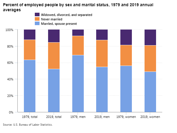
There are more working women. By 1979, women’s share of the employed population, at 42 percent, had already been growing for some time; it was up from just 28 percent in 1948. It kept growing for about 20 more years, before leveling off at around 47 percent by 2000 and remaining there through 2019.
What’s love got to do with it? Between 1979 and 2019, the trend in marital status was more pronounced than the trend in gender. The fraction of all workers who were unmarried grew from 36 percent to 48 percent. This trend was sharper among men (31 percent to 45 percent) than women (44 percent to 51 percent).
Editor’s note: Data for this chart are available in the table below.
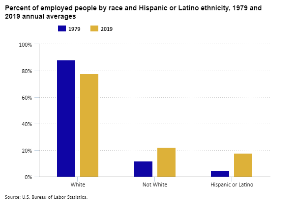
Racial and ethnic diversity is changing too. The U.S. population has long been very diverse, shaped by colonization, slavery and emancipation, and migration. Over the last 40 years, workforce diversity has been shaped mostly by immigration and by differences in fertility among racial and ethnic groups. Between 1979 and 2019 the non-White fraction of all U.S. workers grew from 12 percent to 22 percent. The fraction who are Hispanic or Latino (who may be of any race) grew from 5 percent to 18 percent. A note of caution: the survey questions about race and ethnicity changed over the years, and this might skew the measurements a little, but not enough to change the story that non-Whites and Hispanics and Latinos represent a growing share of employed people. The latest survey questions provide lots of detail about diversity today.
Editor’s note: Data for this chart are available in the table below.
The more you survey, the more you know. Changes in the CPS and other surveys affect more than just our measures of labor diversity. Of course, we can’t measure everything all the time. Big household surveys can be expensive for taxpayers and burdensome for the thousands of households who answer the long questionnaires. Over time, we may change how we think about who we are and what we do, so survey questions must change as well. New survey questions can inform us better about where we are today, but they can make it harder to compare conditions over time. For example, beginning in 1992, the CPS questions about educational attainment were changed to emphasize degrees earned rather than years of school completed. We know that the fraction of U.S. workers age 25 or older who had a bachelor’s degree or higher grew from 27 percent in 1992 to 42 percent in 2019, but we don’t know for sure what percentage of the workforce was this educated in 1979.
The CPS has its roots in a tough time for American labor. The Great Depression of the 1930s brought mass unemployment to the United States. Back then, there was no sure way to measure the problem or track progress toward recovery. By the end of the 1930s, the U.S. launched the monthly household survey that today we call the CPS. The survey has gone through many changes, but it has measured unemployment each month since then. For economists like me, the history of the CPS is almost as interesting as the history of American labor. If you happen to be an economist or statistician yourself, BLS and the U.S. Census Bureau can tell you all you need to know about this great source of information. But not today – it’s Labor Day! Save the technical stuff for after the celebration.
| Year | Ages 16–19 | Ages 20–24 | Ages 25–54 | Ages 55–64 | Age 65 and older |
|---|---|---|---|---|---|
1979 | 8.2% | 14.5% | 62.6% | 11.7% | 3.0% |
1980 | 7.8 | 14.2 | 63.4 | 11.7 | 3.0 |
1981 | 7.2 | 14.1 | 64.3 | 11.5 | 2.9 |
1982 | 6.6 | 13.8 | 65.3 | 11.5 | 2.9 |
1983 | 6.3 | 13.6 | 66.0 | 11.2 | 2.9 |
1984 | 6.1 | 13.5 | 66.8 | 10.9 | 2.7 |
1985 | 6.0 | 13.0 | 67.6 | 10.7 | 2.6 |
1986 | 5.9 | 12.6 | 68.4 | 10.4 | 2.7 |
1987 | 5.9 | 12.0 | 69.2 | 10.2 | 2.7 |
1988 | 5.9 | 11.5 | 69.8 | 9.9 | 2.8 |
1989 | 5.8 | 11.0 | 70.5 | 9.8 | 2.9 |
1990 | 5.5 | 11.3 | 70.9 | 9.4 | 2.8 |
1991 | 5.0 | 11.0 | 71.8 | 9.3 | 2.8 |
1992 | 4.8 | 10.9 | 72.3 | 9.3 | 2.8 |
1993 | 4.8 | 10.7 | 72.5 | 9.2 | 2.8 |
1994 | 5.0 | 10.4 | 72.5 | 9.1 | 3.0 |
1995 | 5.1 | 10.0 | 72.8 | 9.2 | 2.9 |
1996 | 5.1 | 9.6 | 73.1 | 9.3 | 2.9 |
1997 | 5.1 | 9.6 | 72.9 | 9.5 | 2.9 |
1998 | 5.4 | 9.6 | 72.5 | 9.8 | 2.8 |
1999 | 5.4 | 9.7 | 72.1 | 10.0 | 2.9 |
2000 | 5.3 | 9.7 | 71.8 | 10.2 | 3.1 |
2001 | 4.9 | 9.7 | 71.5 | 10.7 | 3.1 |
2002 | 4.6 | 9.8 | 70.9 | 11.5 | 3.2 |
2003 | 4.3 | 9.8 | 70.6 | 12.1 | 3.3 |
2004 | 4.2 | 9.9 | 70.0 | 12.4 | 3.5 |
2005 | 4.2 | 9.7 | 69.5 | 12.9 | 3.6 |
2006 | 4.3 | 9.6 | 69.0 | 13.4 | 3.7 |
2007 | 4.0 | 9.6 | 68.8 | 13.8 | 3.8 |
2008 | 3.8 | 9.4 | 68.4 | 14.3 | 4.1 |
2009 | 3.5 | 9.1 | 68.0 | 15.0 | 4.4 |
2010 | 3.1 | 9.1 | 67.7 | 15.6 | 4.5 |
2011 | 3.1 | 9.3 | 67.0 | 15.9 | 4.8 |
2012 | 3.1 | 9.4 | 66.1 | 16.3 | 5.1 |
2013 | 3.1 | 9.4 | 65.6 | 16.5 | 5.3 |
2014 | 3.1 | 9.5 | 65.3 | 16.7 | 5.4 |
2015 | 3.2 | 9.4 | 64.9 | 16.8 | 5.7 |
2016 | 3.3 | 9.3 | 64.7 | 16.9 | 5.9 |
2017 | 3.3 | 9.2 | 64.5 | 17.0 | 6.0 |
2018 | 3.3 | 9.0 | 64.4 | 17.1 | 6.2 |
2019 | 3.3 | 9.0 | 64.1 | 17.1 | 6.6 |
2020 | 3.2 | 8.5 | 64.5 | 17.2 | 6.6 |
| Marital status | 1979, total | 2019, total | 1979, men | 2019, men | 1979, women | 2019, women |
|---|---|---|---|---|---|---|
Married, spouse present | 63.6% | 52.3% | 69.0% | 55.0% | 56.1% | 49.1% |
Never married | 24.1 | 32.3 | 23.3 | 32.6 | 25.2 | 31.9 |
Widowed, divorced, and separated | 12.3 | 15.5 | 7.7 | 12.3 | 18.7 | 19.0 |
| Year | White | Not White | Hispanic or Latino |
|---|---|---|---|
1979 | 88.3% | 11.7% | 4.8% |
2019 | 77.7 | 22.3 | 17.6 |